
Running a solar installation business means tracking more than ever — project pipelines, proposal conversion, battery upsells, permit turnarounds, financing mix, and team engagement. The companies pulling ahead aren't necessarily the ones working harder. They're the ones who can see exactly where things are slowing down — and fix it fast.
That's the problem Solargraf's Analytics Dashboard was built to solve. Not a report you run once a quarter, but a live, centralized view of your entire operation — from the moment a project is created to the day a proposal is signed.
Things every solar business discovers too late
Before we get into what the dashboard shows, here's what happens when you're flying blind:
Proposals are being sent but homeowners aren't opening them.Without data, you assume the product is the problem. The real issue is follow-up cadence.
Projects sit in "design pending" for days before a proposal goes out.By the time you notice, the homeowner has already talked to a competitor.
Most of your proposals are PV-only. Storage adoption is low.
These aren't hypothetical problems. They're the patterns that emerge when you finally put your business data in one place and look at it honestly. The Analytics Dashboard gives you that view — and the specificity to act on it.
See your entire sales funnel in one number
At the top of the dashboard, four KPI cards track the core stages of your sales pipeline in real time: projects created, proposals sent, proposals seen, and proposals signed. Each card shows month-to-date movement and compares it to the prior month — so you know immediately if you're trending up or slipping.
The power isn't in any individual metric. It's in reading them together:
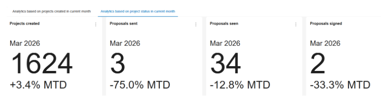
When 38 proposals go out but only 14 are opened, that's not a close rate problem — that's a delivery and follow-up problem. Without this view, most contractors would assume the issue is pricing or product fit. With it, you know exactly where to focus.
What else the dashboard tells you — and why it matters
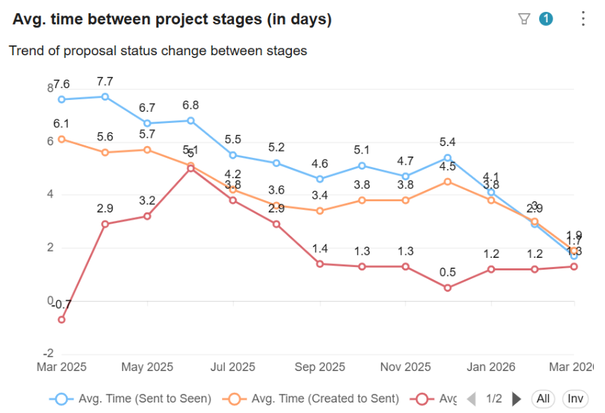
Pipeline speed — by stage
How many days does it take from project creation to proposal sent? From sent to seen? From seen to signed? Tracking these intervals over time reveals exactly where deals are getting stuck — and whether your operations are getting faster or slower month over month.
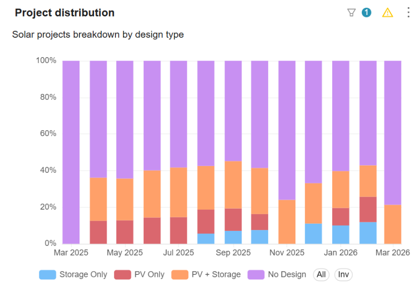
Battery upsell performance
See the split between PV-only, PV+Storage, and storage-only proposals each month. If your team is consistently defaulting to PV-only, you have a coaching opportunity — and potentially a significant revenue gap you haven't quantified yet.
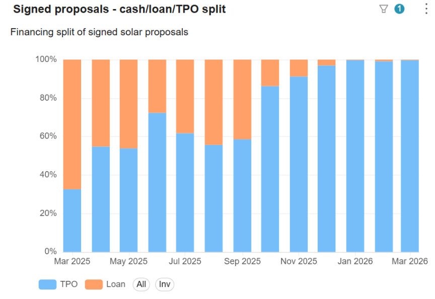
Financing mix visibility
Track which financing options — cash, loan, or TPO — your signed proposals are using. A heavy skew toward one option often means your team is defaulting to what's familiar, not what's best for the customer — or your margins.
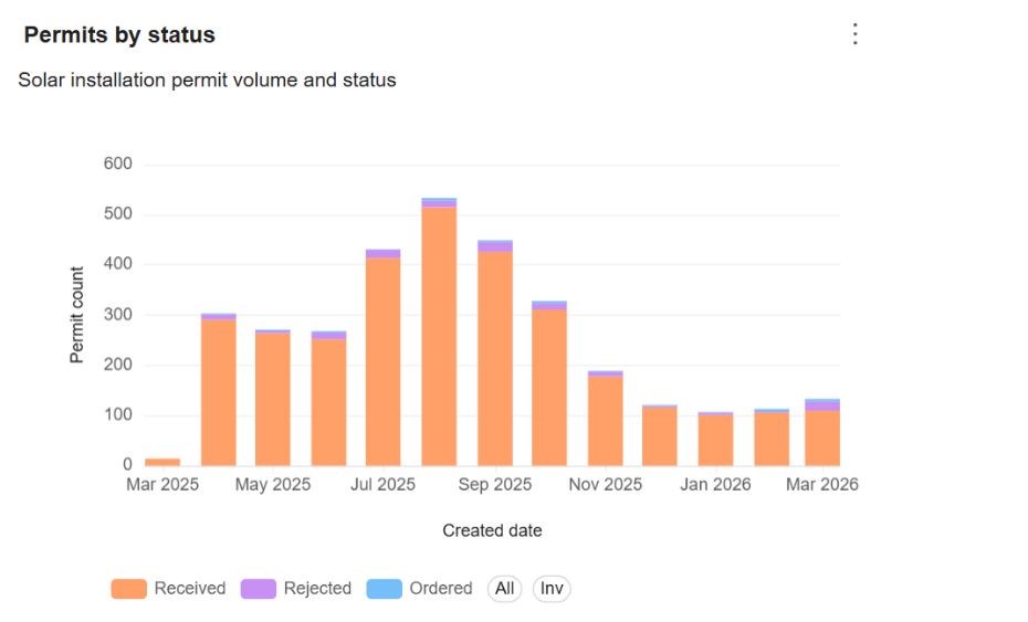
Permit health at a glance
Permitting is where solar timelines most commonly collapse. The dashboard tracks submissions by status — ordered, received, rejected — so you can spot recurring rejection patterns before they create a backlog.
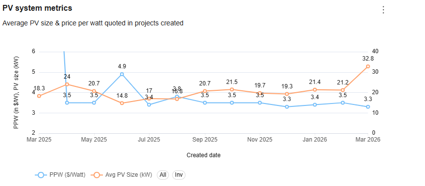
PV system metrics
Analyze the average PV size and price per watt quoted in the proposal created. A dual-line chart can help track metrics for better understanding.
- PPW (Price Per Watt) — The average price per watt quoted in your proposals.
- Avg. PV Size (kW) — The average system size (in kW) quoted in design options.

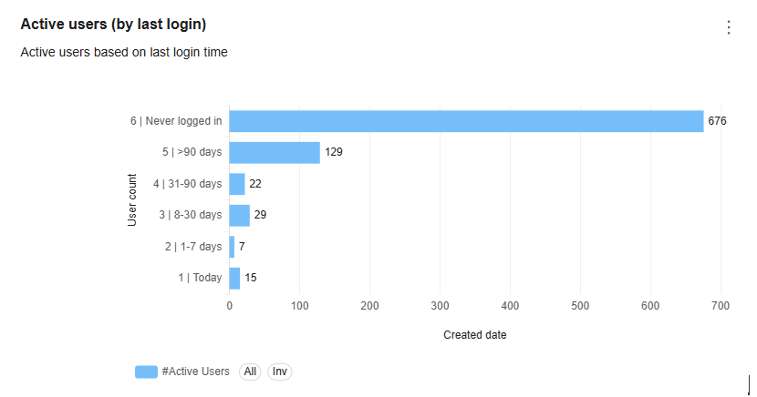
Team adoption & engagement
See which team members are actively creating projects and which haven't logged in for weeks. If you're investing in a platform but half your team isn't using it, you're leaving efficiency on the table. This metric makes that visible.
The companies that scale in solar aren't the ones with the most leads. They're the ones who know — at any given moment — exactly where their pipeline is healthy and where it needs attention.
This isn't a report. It's a daily operating habit.
Most business intelligence tools produce reports you look at once a month, shrug at, and forget. The Analytics Dashboard is designed differently — it's built to be reviewed daily, the way a sales leader looks at a CRM or a field manager reviews a job board. Filters let you slice by time period, state, project owner, or zoning, so you're always looking at the segment of the business that needs attention right now.
For contractors running multiple teams or operating across states, that kind of granularity isn't a luxury — it's how you manage at scale without losing visibility into individual performance.
The bigger picture
Solar is getting more competitive at the exact moment it's getting more complex. Homeowners are more informed, financing options are more varied, storage requirements are more common, and permit jurisdictions are more demanding. The installers who win in that environment won't just be the ones with the best panels or the lowest prices — they'll be the ones who run tighter operations, respond faster, and use data to make smarter decisions every week.
The Solargraf Analytics Dashboard is one part of a platform built for exactly that. From automated design and permit generation to real-time proposal tracking — everything connects, and everything is measurable.
See what your pipeline is telling you.
Get access to the Analytics Dashboard and the full Solargraf platform — no hidden paywalls, premium features from day one.
Want to know more?
Join our upcoming webinar to dive deeper into our enhancements.
Schedule a demo for a personalized walkthrough on understanding how Solargraf can add value to your business.
Thank you for being part of our growing community; we can’t wait to show you what’s next.


