Help Center Proposal Setting
Solargraf’s advanced customization proposal experience: How To’s
Published on 24 Nov 2025
Learn how to make the most of the advanced proposal customization experience. This guide covers everything from adding elements and adjusting layout properties to managing content within your proposal. The capabilities listed below are available only to users who have enabled the ‘Use enhanced proposal format’ toggle.
The capabilities listed below are available only to users who have enabled the ‘Use enhanced proposal format’ toggle. You can change this setting in your user preferences.
How to edit the proposal template?
Navigate to your template via one of the following:
- Company Settings > Proposal & Documents > Proposal Templates > click the edit icon next to the template you want to modify.

Project Settings > Go to edit proposal > Select your template, then click Edit template to open it directly in edit mode.

- When you're done making changes, click Save, then select Return to proposal to continue where you left off.


How do I preview a proposal template?
Navigate to Proposal templates in company settings:
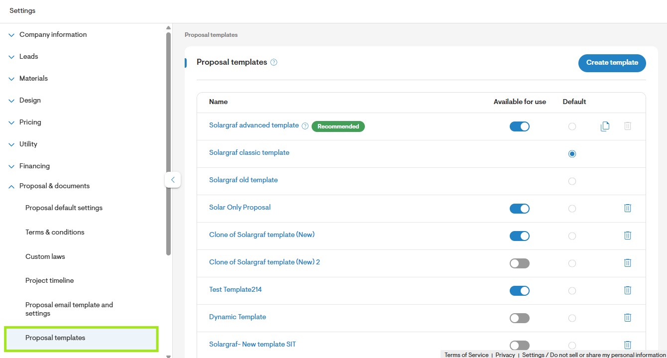
- Click the recommended template you want to preview.
- A new page opens, displaying the template with all its default sections.
- Use the available options to: - Toggle betweenlight and dark mode. - Change the language of the template. - Preview the proposal in all available modes to ensure it meets your requirements.
- Click Clone template in the left panel to create your own copy for customization.
Note: Changes made while previewing a template are not saved. Mode and language selections are for preview purposes only and won't be retained.
How to enable inline editing for built-in sections in proposal templates?
Click Create template in Company Settings.
A pop-up will appear prompting you to enter a template name.
Click Save to create and store the template.
Click the edit icon to open the template in the editing interface.
All sections within the newly created template will display an edit icon, allowing inline editing.
- Click the edit icon on a section to open it in grid layout, where you can modify the content, layout, and elements as needed.

How to import existing built-in sections in advanced customization?
- Use the search bar in the left panel to find the section you want, or go to Built-in sections to browse available options.
- Drag and drop your desired section into the workspace on the right.
- Make sure the workspace is empty before dropping it, as it will replace any existing elements.
- Click any element within the section to adjust its properties using the left panel controls.
- You can also add additional elements to further customize the section.
- Only one built-in section can be added to the workspace at a time.

How to identify which sections support full customization while others have limited capabilities?
- The following sections have limited editing capabilities: Cover, Design, Why Go Solar Now?, Why Add a Battery?, Power of Enphase, and Review and Sign.
- These sections rely on complex logic or heavy data processing, so editing is restricted to ensure the proposal functions correctly.
- Look for the info message displayed within these sections to quickly identify them.
- For sections with limited capabilities, you can still make basic edits, including: section name, title, padding, background settings, and applicable toggles.
- All other sections are fully customizable without restrictions.
How to import layouts in advanced customization?
Go to Layouts in the left panel of the custom section.
Drag and drop your desired layout into the workspace on the right.
Make sure the workspace is empty before dropping it, as it will replace any existing elements.
Only one layout can be added to the workspace at a time.

How to undo/redo changes
Click Undo (top-right) to revert the last change.
Click Redo (top-right) to restore an undone change.

How to rename an advanced custom section
In the left panel, update the text in the Section name field to rename the section.
Each section must have a unique name.
Entering a name that's already in use will trigger an error.

How to add an element
Use the search bar in the left panel to find the element you want.

Drag and drop the element into the custom section window.

- Click the element to access its formatting options in the left panel.

Refer to this article on element properties for more detail.
How to delete an element
Click the element you want to remove.
In the left panel, click the bin icon next to the element name.

Confirm deletion if prompted.
How to select the parent of a child element
Click the child element. In the left panel, this will highlight and select the parent container.

How to move elements within an advanced custom section
Click the element you want to move.
Drag the element using the move icon that appears inside the element.

Drop it in the desired position.
How to navigate between Webquote and the advanced custom section
From Webquote → Click the Edit icon on a custom section.

From the advanced custom section → Click Back to main panel to return to Webquote.

How to change grid properties
- Drag and drop a Grid element into the section. A cell is added by default.
Click Add cell to add more cells.
Use Columns to set how many columns the grid should have.
Use Row Gap and Column Gap to define spacing.
Adjust content position, padding, and border weight as needed.

How to modify cell properties
Select the Cell in the section.
Use Format cell to modify row/column span or adjust gap.
Click Background to apply a background color or image.

Adjust content position, padding, and border weight.
How to add separators
- In the left panel, click Separators.
- Choose Spacer or Divider.

- Drag and drop them into the layout.
- Select it to access formatting options in the left panel.

Spacer formatting panel
Divider formatting panel

Use this link to learn spacer/divider related properties.
How to adjust text box properties
Select the Text element.

In the left panel, modify background, margin, or border weight.

Double-click the text box to enable rich text formatting.

From the formatting toolbar, adjust font size, color, alignment, style, or add links/placeholders.
How to add placeholders
Double-click the text box to open rich text formatting.
Click Placeholders.
Choose the placeholder from the dropdown list.

How to adjust icon properties
Drag and drop an Icon element. The default icon is the “info” icon.

Use the Icon dropdown to choose a different icon.

Adjust size, color, alignment, or fill.

Modify margin or border weight if needed.

How to change button properties
Select the Button element.

In the left panel, enter a URL for the button’s destination.

Use the Text field to set the button label.

Adjust the alignment, color, and variant.

Modify margin or border weight as needed.