Help Center Financial Setting
Financing Dashboard in Solargraf
Published on 19 Aug 2026
The Solargraf analytics dashboard now includes a dedicated Financing dashboard, giving you visibility into the lease and loan applications sent from your projects. This dashboard helps you:
See which financing partners and application types your team uses most
Identify bottlenecks in your sales and operations pipeline
Track team and company performance over time
Make data-driven decisions about which financing options to prioritize
Accessing the dashboard
The Financing dashboard is available within the Solargraf analytics section. Navigate to Analytics > Financing dashboard to view it.
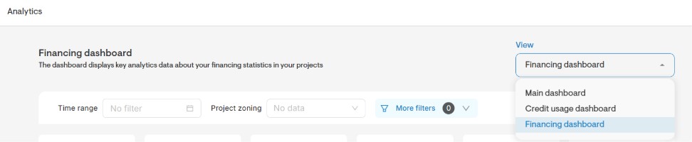
Filters
Use these filters to narrow the data shown across every chart on the dashboard:
Filter | Description |
Timeframe | Select a specific time period or custom date range |
Project zoning | Filter by project zoning type – Residential or Commercial |
Company name | Filter by a specific company |
Project owner | Filter by the individual owner assigned to a project |
State | Filter by the project's state |
Filters apply globally — set one and every chart updates at once, so you can compare performance across months, quarters, or custom date ranges without adjusting each chart individually.
Tip:Use the timeframe filter alongside company name or project owner to benchmark performance between reps, teams, or specific time windows (e.g., comparing Q1 vs. Q2 close rates).
Dashboard components
1. KPI summary cards
KPI (key performance indicator) cards at the top of the dashboard give a quick snapshot of projects created with each loan or lease application type.
Each card shows:
The total count for that metric
A month-to-date (MTD) percentage change, comparing the current month's data to the equivalent period in the preceding month
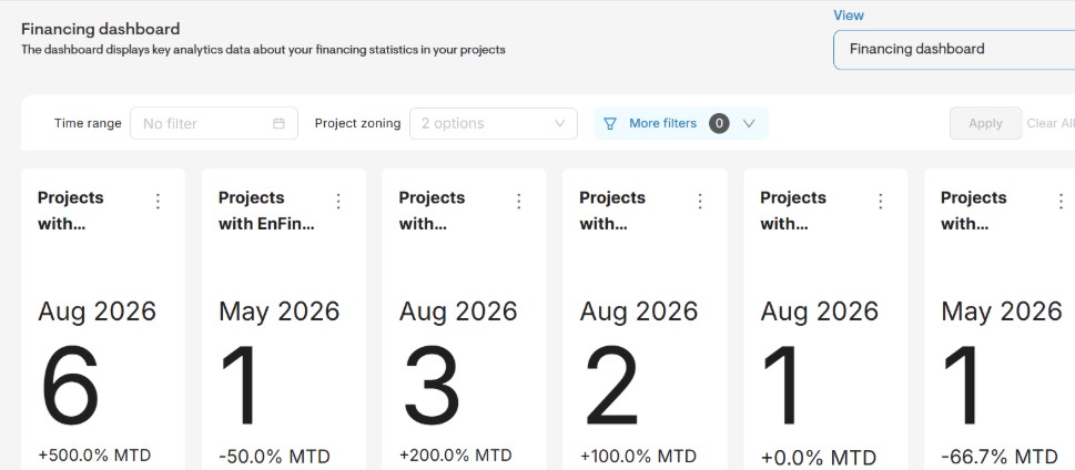
How to use this insight: Use the KPI cards to quickly identify which loan or lease application type is most used in a given month, and whether usage is trending up or down compared to the prior month. This is a fast way to spot shifts in customer or team preference toward a particular financing product.
2. <Fintech partner> applications by status
This stacked bar chart shows the monthly count of lease applications submitted through the applicable Fintech partner over the last 13 months, broken down by application status – ‘Approved’, ‘Pending’, ‘Declined’, and ‘Cancelled’. Each bar represents one month, and the colored segments within the bar show how many applications fall into each status for that month.
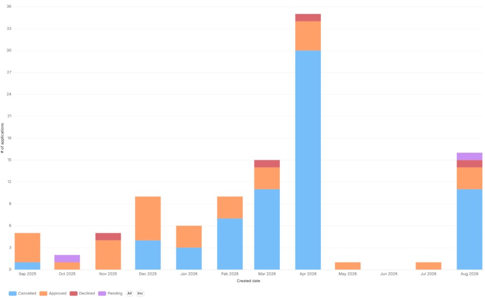
How to use this insight: Use this chart to monitor the progress and outcomes of the applicable Fintech partner. A growing share of "Pending" or "Declined" segments may indicate a bottleneck — whether in application quality, customer eligibility, or lender turnaround time.
Note: The same status-breakdown format is available for every financing partner and loan product Solargraf supports — use it the same way to track performance by lender and spot where applications are stalling.
3. Signed project by financing type
This stacked bar chart identifies the number of signed projects broken down by financing type. Each bar is stacked into two segments – ‘Loan’ and ‘TPO’.
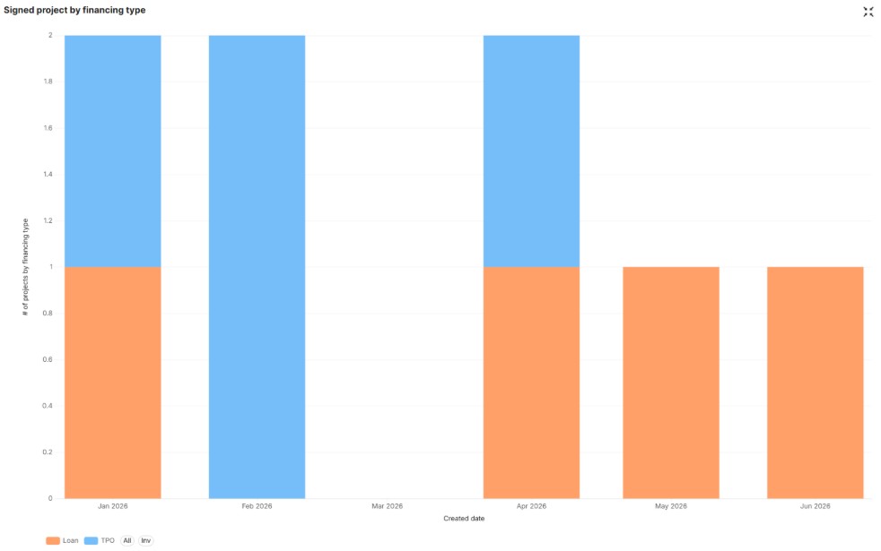
How to use this insight: Use this chart to understand which financing type — loan or lease (TPO) is driving the majority of your signed deals over time. This helps you spot shifts in customer preference (for example, a growing share of TPO deals may signal increased demand for no-money-down options) and can inform which financing partners or products to prioritize promoting to your sales team.
4. <Fintech partner> applications by installer
This table shows the corresponding Fintech partner’s application data by installer: each row is an installer, each column is the selected timeframe (week, month, or quarter), and each value is the number of applications that installer submitted in that period.

How to use this insight: Use this table to track and compare individual installer performance over time. It's useful for identifying top performers, spotting installers whose application volume is dropping off, and setting benchmarks across your team. Toggle between week, month, and quarter views to zoom in on recent activity or spot longer-term trends.
Summary
The Financing dashboard gives a clear, real-time view of how lease and loan applications move through your pipeline — which fintech option is performing best, and where deals are stalling. We recommend checking the Financing dashboard weekly to stay ahead of emerging trends and resolve any bottlenecks before they affect your close rate.